
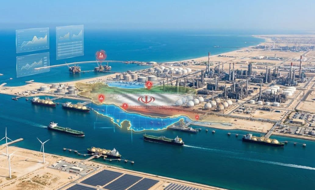
GA Capital · Energy & Geopolitics
Gulf Energy DashboardMarkers, Map, Cascade
Not every Middle East headline is an investment signal. This operating view asks which Gulf shocks already clear into prices, Hormuz traffic, conflict geography, and transmission paths.
The Dashboard Measures What Has Cleared Into Markets
This operating view is built to answer a narrower question than a newspaper page. It asks which Gulf shocks already show up in prices, Hormuz traffic, and plotted conflict events.
The dashboard asks which Gulf shocks already show up in prices, Hormuz traffic, and plotted conflict events — not which headline is loudest.
Situational KPIs, analyst briefing, category feed, and conflict geography. The cascade then shows how stress can transmit into adjacent markets.
Start with markers and Hormuz pulse, confirm with incidents on the map, then use the feed and cascade for transmission paths.
Situational Monitoring Is Separate From Headline Noise
The useful dashboard sequence is markers and Hormuz first, conflict geography second, and cascade transmission last.
The Gulf Energy Dashboard is the operating view of the same intelligence registry behind the editorial report. It compresses live markers, analyst briefings, a category feed, and conflict geography into one underwriting surface.
Unlike a newspaper page, this view is built for situational monitoring. Prices and Hormuz traffic show whether stress is clearing into markets. Conflict events show where energy assets and theaters are being hit. The cascade shows how those shocks can move into feedstock, power, and end markets.
This Insights migration keeps the monitoring exhibits and drops product chrome such as chat. The goal is a clear investment read of Gulf energy stress, not a clone of the AnalystAI workspace shell.
Situational KPIs Show Whether Stress Is Clearing Into Markets
These markers come from the live Gulf intelligence registry and conflict-event counts. They replace theatrical crisis placeholders with the current underwriting pulse.
Loading situational KPIs…
The Situational Briefing Compresses the Latest Cycle Into One Read
Analyst briefings are generated from the latest intelligence cycle. They sit above the raw feed so underwriting can start from a single situational summary.
Loading briefing…
The Live Feed Separates Categories Without Dumping the Full Firehose
Use the category chips to move between conflict, oil price, LNG, shipping, sanctions, and cascade items. Source labels link out when a durable URL is available.
Loading live feed…
Conflict Geography Locates Where Energy Assets Are Under Stress
Plotted events come from the conflict registry. Severity color matters more than raw count: critical and high hits on terminals, fields, and ports are the underwriting signal.
Loading conflict geography…
The Cascade Shows How Confirmed Gulf Stress Can Transmit
Once markers and conflict geography confirm a shock, this curated dependency graph shows how pressure can move into naphtha, ammonia, power, steel, freight, and electronics.
Cascade markers are a curated transmission model. They explain paths from Gulf energy stress into adjacent markets; they are not a live tick-by-tick simulation of every price.
Read Markers First, Then Confirm Geography and Transmission
Close the dashboard with a simple sequence. Check whether stress cleared into prices and Hormuz traffic, confirm with conflict geography, then use the cascade for transmission paths.
Live Brent and gas markers plus Hormuz vessel snapshots are the highest-confidence continuous pulse for whether disruption is clearing into markets.
Plotted conflict events show theater, severity, and targeted assets. Coverage is event-based and should be read with dates and severity, not as a complete battlespace feed.
Analyst briefings and the category feed are directional. The energy cascade is a curated dependency model for transmission paths, not a live simulation of every market.
- 01.Start with the KPI strip. If Brent, gas, and Hormuz traffic are calm, treat loud headlines as ambient until the map or feed confirms physical stress.
- 02.Use the conflict map to locate energy-asset hits and theater concentration. Severity color matters more than raw incident count.
- 03.Read the cascade last. It explains how a confirmed Gulf shock can transmit into naphtha, ammonia, power, steel, and freight — the path from event to margin.
- EIA: The Strait of Hormuz is the world’s most important oil transit chokepoint
- IEA: Oil Market Report — June 2026
- CSIS: CSIS analysis library — Middle East energy and security